NYT article about immigration system
This NYT article has some great graphics including historical data and some of the basics of our immigration system. For quick reference, I've copied and pasted their graphics below, but the entire page is well worth visiting.
This first chart looks at the proportion of immigrants relative to the US population from 1860 to projected 2060. Notice that current numbers (2016) do not yet match the height of migration to the US at the turn of the century (last great wave of migration).


This first chart looks at the proportion of immigrants relative to the US population from 1860 to projected 2060. Notice that current numbers (2016) do not yet match the height of migration to the US at the turn of the century (last great wave of migration).

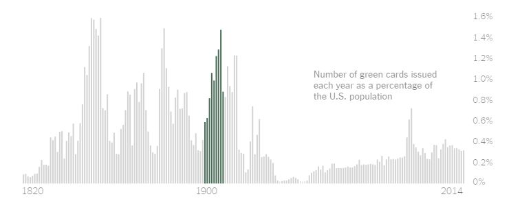
Given the long history of immigration to the US, when we say we want to return to "historical period" of immigration, it's worthwhile considering tow what "historical period" we are referring. Here's a graph of the green cards issued as a percentage of the US population. For the historical period between 1924 (when the US seriously curtailed migration with the passage of the Johnson-Reed Act of 1924) to 1965 (when the US reopened its borders to immigrants). Notice that in many ways this period is an anomaly rather than the norm for US immigration history.

What if we agreed that we should return to a "historical period" of immigration and just chose a different period? Notice that the 2014 rate of 0.3% is far below the period of 1900 (1.4%).
Finally, here's a chart of how current US immigrant laws prioritize green card issues. Notice that the large majority of green cards issued are based on family reunification.

Given all this data, how do you think we should reform our immigration policy?
Comments
Post a Comment